Monday 28 February 2011

Merchandise Designs:


Band Logo:

The logo won't appear on any of my final texts, because it doesn't look professional enough. However, it will appear on some merchandise which I am planning on designing, to help (with this logo) to create a band identity.


It follows the style of Russian Constructivism, even featuring the russian-style font which has become iconic of my fictional band 'Renegades' (or 'The Renegades' as they would most likely be referred to). It also abides by my chosen colour scheme, with the added white colour on "we are the" to make it stand out, as it is the band's slogan/motto. If I had the time, I think I'd be able to expand on this idea, and incorporate it into my music video and ancilliary texts. However, it is at the bottom of my list of things to do at the moment.


Sunday 27 February 2011

Screen Test:

Below is a video showing my new lyric boards, in a test situation. I decided to do this video, so I could see if the lyric boards showed up clearly on-screen, and more importantly if the audience could see the lyrics that are on the board.


As you can see, when doing this screen test, the lighting was too strong on the lyric boards, causing a reflection. I had messed around with the lighting and this was the best I could get it without de-illuminating the green screen background. Basically, if it is too dark, Chroma Key won't work properly. However, I think, during editing, that I'll be able to lower the brightness and higher the contrast to make the lyric boards more darker, allowing the lyrics on the board to clearly be seen. Now I know this, I can shoot my proper footage.

Friday 25 February 2011

Audience Feedback: New Lyric Board + Background Designs:


Feedback Analysis:

Out of 10 feedback forms, only one (shown above) preferred figure 2, in relation to the background. This is because it seemed more natural, which that particular person must have preferred. The audience tended to prefer the new lyric boards, because they looked more professional and stood out more. In addition, the old lyric boards looked more "personal" and where easier to read, but the new lyric boards where more "interesting". Taking this in to account, I have decided that I will use the new lyric boards, by filming the entire sequence with them. However, I am going to test them with the audience again, as on film they may not stand out. I will get them to choose between the new and the old lyric boards, once again, which will determine what my final product will look like. I will also be using the colourful backgrounds in my music video, for certain, because the audience stated that it looked more eye-catching, modern and professional. It also goes with my Russian Constructivism visual style, as do the lyric boards, and so that is an even greater reason to incorporate the backgrounds in to my music video.

Monday 21 February 2011

Update:

This is a quick update to inform you that I have edited the majority of the photographs, for the background, and I will finish them in the next couple of days, when there will be another post update. However, before I go any further than than, I have decided to ask the audience whether they prefer the original photo, of just the industry, or the edited photos, in which I have added the three colours of my colour scheme, which are black, red and yellow. This will be done in the form of a questionnaire. In addition to this, the questionnaire will ask the target audience whether they prefer the newly designed lyric boards, or prefer the old ones. This will help me decide whether or not to use them, as I have been having some concerns as to whether the lyrics on the board will stand out and/or be easily read by the audience.

Saturday 19 February 2011

Background Sequence Sample 1:

I have begun editing my photographs which I took of industry resemblent of Russian Constructivism. Below is a sample:


I plan on having the two different colours flashing on and off, or something similar.
Most likely, this will be done to the beat of the music.

Below is another example:

This will be the one I use. I have added black to the photo, which creates
a greater contrast.

Friday 18 February 2011

Update:

I have decided to take photographs for my background sequence in my music video. This is because I plan on editing them, so they conform to the colour scheme of my digipak and magazine advertisement. The photographs have been taken, and a collection are shown below:

Picture of a street; dominated by industry and focussing on
the closed cocoa mill


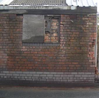
Again, showing the cocoa mill, but also looks more
derelict with the damaged wall in the foreground
Storage tanks can be seen, which hold gas to the best of my knowledge.
Not sure if this will be used, unless I can hide the parked car
behind the lead singer.
More storage tanks, which may be good to change the colour, possibly
to the beat of the music?

A narrow street, with dull brick walls and pipes overhead, which
may or may not be used in my music video. I am thinking about putting colours
in to the video, and change them, as I just said, to the beat of the music, but
that would be very limited with this photo.

Digipack: Inside Sleeve 3:

(This will accompany my CD and DVD on the inside of my Digipack)

I added my photograph to Adobe Photoshop CS3

I cropped the photo appropriately, then I added a dark strokes
effect twice (to create a darker photo)

I added lyrics from one of the songs from the album - 'City in a Rut'

Final Draft of Inside Sleeve 2: (DVD Section):

I created a large circle in the centre, and added the 'dark strokes' effect on
Photoshop CS3. I also did a vertical fade on some red, to make the background.

I added the piece of plastic in the centre, which will hold my CD in place,
so I could work around it.

I added all of the information that you would find on the Digipack somewhere. In
this case, I added it to the sleeve which will hold the DVD.

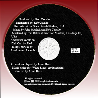
I added more institutional information, including the record label's logo, as
well as the copyright statement and who directed the music video.
All of these features are conventional of a Digipak, and are usually found on the back
cover. For aesthetic reasons, I placed it under the DVD.

Below is what this panel looks like with the bonus DVD on top:

Final draft of Inside Sleeve 1: (CD Section):

Inside sleeve of my Digipak which will hold the CD in place.


Same as above, except with the addition of the CD


Wednesday 16 February 2011

New Institution Logo:

Above is the logo I created which is a play on the name of the established record label 'Rough Trade', which was the institution that Renegades was initially planned to be signed to. I designed it to look "rough" so to fit the conventions of rock music, as being rough and edgy.

Second Draft of my DVD:

This is the second draft of my bonus DVD, which will feature my music video for 'White Lines'. As you can see, I have changed the logo, like I did on my CD (but didn't mention) for 'Rough Trade'. I was forced to do this as I needed to feature an institution on the CD, but I became aware of copyright which meant that I wouldn't be able to use the logo, just in case. I have, however, done my own, called 'Ruff Trade', which I will incorporate in to my other ancillary texts which feature the logo. I have also, like the CD design, kept things minimal, as CD's aren't conventionally littered with text and other things.

Friday 11 February 2011

Second Draft of my CD:


I decided to redesign my CD because the vinyl record design didn't fit with my theme of Russian Constructivism. The new design, however, does and also follows my colour scheme of red, black, cream with the addition of white, also. Furthermore, the text of the album title and band name are in the russian font that I have used throughout my production. I noticed, also, that a recurring feature of CD's are the addition of the tracklist on it; a convention I hadn't previously noticed. I decided to make my disc more conventional whilst also making it more 'alternative' and 'anti-mainstream' by writing in the tracklist in a messy, scruffy manner, making it look scruffy and follow the conventions of the anti-conventional alternative rock and indie genres.

Thursday 10 February 2011

Update:

I have been shooting some background scenes for my music video. Some stills are shown below, and are likely to feature on my music video. They are all inspired by russian constructivism, featuring sharp angles and industry.

Tuesday 8 February 2011

Lyric Boards 2:

Here is another lyric board that I have designed. As previously stated, they have a wide range of looks, mostly influenced by different Russian Constructivist propaganda posters. However, the one shown below was influenced by a front cover of Blink-182's self-titled album, which is shown below my lyric board.

One of my lyric boards, influenced by the below media text,

The Blink-182 self-titled album that influenced my lyric board.

I tried to employ a paint-brush effect, like the album cover, on my lyric boards, simply because it looked good, and allowed the lyric on the board to stand out. However, because the album cover is an example of a 'pop-punk' album, it used bright vibrant, and unconventional colours that stood out (turquoise and pink) to convey the album tone. I stuck to my colour scheme of black, red and cream, by making the paint strokes cream.

Lyric Boards Influence:

I have taken influence from the below image, for my newly designed lyric boards, as I did with my front cover of my digipak.

Monday 7 February 2011

Comparison:

I have taken a picture of the old lyric boards, so a comparison can be seen between the new and the old, and how much better the new boards are, especially seen as though they follow with my theme of Russian Constructivism. The new boards also have a section of a Communist Russia propaganda poster, which is situated at the tip of the red horizontal triangle.


Example 1 of my previous lyric boards

Example 2 of my previous lyric boards

Update:

I have completed my new lyric boards. Some vary in style, like the ones shown below on the previous post compared to these new ones here:


My lyric boards designed on the computer, having a socialist (such as communist Russia/soviet Russia), will be stuck on to pieces of card, like the ones I originally used, so they are rigid and sturdy.

Sunday 6 February 2011

Lyric Boards:

Below are a few examples of the re-designed lyric boards. They have been done on the computer, using Photoshop CS3, as opposed to the original hand-drawn (and fairly boring) originals. These new ones, as you can see, follow my red, black and cream colour scheme and are intertextual to my digipak front cover as well as the Franz Ferdinand CD cover that has influences my ancillary production. I plan, next week, to re-shoot my music video, once again, to feature the new lyric boards as well as another thing:

I plan on making my video in colour, as opposed to the indie rock convention of black and white. This is because I will have my lead singer, starring in the music promo, change costume (have him wearing 2 or 3 different coloured check shirts and inter-cut them to the beat of the music). This will mean I will have to film the music video two or three times, but the end product will mean that it is worth the time and production. I do, however, plan to edit the footage, making it dark and low-contrast, giving it an 'almost-B&W' look.

Example 1 - Has a white font. Same font found in my Digipak

Example 2 - Has a black font. Same font found in my Digipak.

Friday 4 February 2011

Inside Panel 3: Original Idea -

I originally planned on having something like the pictures shown below, in the inside panel:


I took a photo with their names and band role on an A4 piece of card


I added the 'cut out' effect on Adobe Photoshop CS3


To follow the new colour scheme, I then added the different colours
- intertextual reference to my music video as Billy is holding up his card upside down
 

Thursday 3 February 2011

Second Draft Edit:

I have done re-shoots of my music video. I have also been editing the music video, and below is how it is turning out: