
Media Representations:
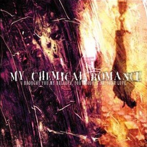
The entire band, My Chemical Romance, is being represented by the above text. The text is an album cover for their fourth studio album, entitled 'Danger Days: The True Lives Of The Fabulous Killjoys'. The album art doesn't show the band, which isn't unconventional as it is not usual for the band to appear on their album art. However, some representation can be seen in the above text, such as the large logo of the band situated in the middle. The logo represents a spider, a large deadly one, who's name escapes me. It is a form of tarantula, however. This logo represents danger and deadliness, which references the title of the album with the title including the words "kill" and "Danger". The lightning strike, seen in the spider's body, also connotes danger due to the dangerous elements of lightning strikes, and its general connotations of danger. Furthermore, the use of mise en scene is peculiar, as the use of an extreme wide long shot is unconventional. The scenery is beautiful, but appears to have nothing to do with the album. However, the shot is an intertextual reference to their music video 'Na Na Na (Na Na Na Na Na Na Na Na)' which is set in the desert, which also features on the album. The logo is also an intertextual reference as it serves as the logo for 'The Fabulous Killjoys', as the album is a concept album; it tells a story, the protagonists of which are the aforementioned Killjoys. There is no real sense of self-representation as the band or lead singer don't feature on the album. In contrast to the unconventional elements of the text, the situation of text on the cover is, in fact, conventional. The album title and band name is clearly shown at the top of the cover, with no price tagshown because that is done independently by the distributors, such as HMV and even Tesco as well as other supermarkets, who are moving in to the music distribution market. However, the above text doesn't convey the actual product correctly. The image, taken from wikipedia is only a representation of what the album will look like, as the name of the band and the album title will not be printed on to the cover, with a sticker being used in its place. Many artists are doing this same thing, and it appears to be a choice by the institution, maybe to save costs? Or maybe it allows the audience to view the album art on its own, without the text over the top. This is because the lead singer of the band, Gerard Way, is an artist and designed the album cover, and so the decision to include the title could have been down to him. The setting, a desert, also has certain connotations, as it is seen as a harsh environment where not much life can prosper and where humans certainly can't live. This, perhaps, represents the musical content of the album as being harsh and brutal, and dangerous, even. This is an element seen in punk music, which further enhances the sense of punk sub-culture as the pink is iconic of the style and music genre.
Narrative:
The only feature of narrative on the above text is the reference to the album's narrative, highlighting the setting only. We can see that it's futuristic due to the desert setting within the mise en scene and the use of bright, vibrant colours such as pink, for example. The setting and colours used together have futuristic connotations due to old 1980's movies which often mixed the two. The album art also helps to create a heroes and villains narrative, as it reveals the 'Killjoys' to be the protagonists due to the use of a white spider, which in binary opposition connotes good, and the fact that the band play the killjoys in the concept album, revealing them to be the protagonists' due to the conventional use of a star being the good person.
Genre:
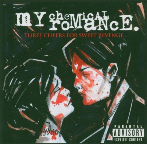
The text belongs to the alternative rock genre of an album cover. It will package the CD album and allow the audience to instantly recognise the album and buy it. The major generic conventions are shown on this text, with all text being situated at the top, as it is the first place the audience looks, and the centred image, in this case, of a spider with a desert background. The unconventional elements, as previously stated, is the use of no text on the cover whatsoever, as the text will be placed on top of the plastic casing on a sticker. In my opinion, the audience's expectations are cheated as with the band's identification, as they are icons of the 'emo' subculture, is shattered with the use of vibrant colours such as pink, which is also associated with punk-rock music, due to the iconography of it. This therefore treats the conventions of the band playfully, as we'd expect the album art to be black and gothic, like the previous albums shown here, here and here, which feature 'bone soldiers', which are evidently dead, as well as blood and obscure writing. This CD cover, on the other hand, features none of the above, with no use of gothic black, but instead the use of bright, beautiful colours. The text doesn't feature a star, like some CD covers would. However, none of the previous album covers of My Chemical Romance don't feature a star, but a drawing of the lyrical content of the album, which have mostly been concept albums. This text, however, features no drawing of the Killjoys, but there logo, so in a way the audience expectations are cheated, but not completely.
Media Institutions:
The text's institution is Reprise Records, which is perhaps best known for its signing of rock artists, and in no way has the institution influenced the text, from what I can see. This element of production, it is not irregular for the institution to stay out of the production process, as rock artists' are notable for having complete creative freedom. Reprise Records is owned by Warner Bros. Records which only matters in the sense that the text would have had more funding to create, seen as though Warner is a conglomerate and has lots of money to pump in to their subsidiaries and products because it is a global company, earning lots of profits.
Media Audiences:
The text is aiming at a teenage audience of 13-19 as well as a mainstream audience of 15-24. However, it is more specifically aimed at the 'emo' subculture, although not as much as their previous albums. Emo is notorious for its suicidal stereotypes and the previous albums highlight this as they feature a boy and girl kissing, with blood splattered on the cover, also. In addition to this, the albums all feature extensive use of black which is iconic of emo. However, this album attempts self-representation, a transformation, as the band have changed from dark, sad music to fast-paced punky music, which can be seen to be true in their music video for Na Na Na (Na Na Na Na Na Na Na Na), which, like I said, features on the above album. However, the audience don't know this until they listen to the album, and for them to listen, they will have to consume the product anyway. The audience are likely to recieve the product in digital format, although it is available in CD format. I, being a fan of the artist and in the targeted audience criteria, evaluated the product as poor. This is because it was hard for me to recognise it to be my chemical romance, as they completely changed their style and it is unusual for them to use colours. However, when deconstructing the CD cover, I begun to understand the text and its meanings.
No comments:
Post a Comment