This will be the panel of my digipak which will hold my DVD (which features the music video I created).
CLICK HERE FOR INSIDE PANEL 2
Above is a link to a later post, which I made, as I hadn't realised I had made this post.
Friday, 28 January 2011
Friday, 21 January 2011
Magazine Advert Work:


The lead singer is conventionally on the magazine advert, at a low-angled mid-shot. The low angle connotes power and dominant, as rock music, the genre I am dealing with, is iconic for its 'macho male' dominance, and so the lead singer must be represented as powerful, not weak. The mise en scene, more particularly the costume choice, consists of the checked shirt, in the colour green, which is of the Atticus brand, and a hat.The hat isn't particularly iconic of the rock genre, but it is increasingly becoming a fashion item for young adults and teenagers/my target audience. The shirt is also a fashion item, and has been chosen because of this, as the lead singer must look good and up-to date fashion wise. However, the checked shirt is also iconic of modern rock music, with the clothing item being brought to fame by Southern USA alternative rock group 'Kings of Leon'. The colours used, such as the green on the shirt, has connotations of envy. However, it wasn't chosen for this reason, but because it went well with the background colour scheme, of which is a greeny-yellow, red and black, with some white. The font used on the masthead of the advert is of a Russian style. I chose this font because of the overall theme of Russian Constructivism, with the colours of red and black added to the colour scheme because of its associations and iconic reference to Communist Russia.The rest of the font on the advert is also in the style of Russian, except for "The Album out Now" which is in a military-style font, because it stood out more than the other font, which was essential because the audience needed to know that the album is now out to consume. Furthermore, following the style of Russian Constructivism the triangles at the top of the page are angular, as is the font, moving in a diagonal direction, opposite all the other text on the page. This also makes it stand out.
The lead singer/model is situated on the left, in large, as to draw in the audience who may recognise him, or recognise his representation as being a lead singer of an alternative rock band. To the left, is the conventional specialist reviews, with snippets of the review, always positive points, added with a star-rating added. This is designed to ensure the audience that the album is good and is worth consuming. The institutions of the reviewers, such as Kerrang! magazine, is situated underneath the reviews, to allow the audience to decide whether they trust their opinion or not. Below these reviews lies the front cover of my Digipack. This allows the audience to see the product itself, which in turn will possibly draw them to buy it, as they know what to expect.
The 'Atticus' brand, found on the lead singer's shirt, is iconic of indie/alternative rock music, because of its associations with Tom Delonge, the lead guitarist and co-singer/songwriter of pop-punk/alternative rock band Blink-182, as he established the company. Since its creation, it has specialised in alternative clothing, and is often a brand which is worn by alternative rock bands. A common occurrence in music advertisements, especially in alternative rock music, is the appearance of brands on clothing. This is because the brands, such as Atticus in this case, will give the band free clothing and money for touring and promotion, amongs other things, in return for the band to wear the clothing and/or equipment and promote that brand. For instance, people will see the Atticus logo, who haven't heard of it before, and because the band is sporting the logo, they believe that it is a good brand and is fashionable. In contrast to this the target audience that does know of the Atticus label but not the band, will now believe in the ideology that the band must be 'cool', modern and talented to be endorsed by a well-known and established alternative clothing label. This addition of institution on to the lead singer's clothing will attract the audience to buy the product that the brand is endorsing. Other institutional information has been added, conventionally, to the magazine advertisement, such as the website of the band, the iTunes logo (conventionally print adverts give the audience a possible distributor that is popular and easily-accessible), as well as the 'Rough Trade' logo, the label which the band are signed to. However, in the final version of this advert, the logo will be changed to a custom logo of mine, with the label being called 'Ruff Trade' in order to avoid copyright infringement. The label is based on the real-life 'Rough Trade' label and is iconic of independent bands, with the label, previously a record store, signing bands that major labels didn't want to sign (punk bands, for example, before they became popular) and because it is an indie label, it seemed appropriate to feature it as a label for an independent band, free from corporate major labels, such as Sony BMG, for example.
The target audience will be the same as most alternative music magazines, such as Kerrang! magazine and NME, as well as Q and Rocksound. The audience will be of the alternative social group, such as 'Indies' and 'Emo's', to name a few. These social groups revolve around style and alternative/indie rock music and will read the aforementioned magazines, and will rely on them to identify music to listen to. They will be teenagers/young adults of the mainstream age of 16-24. They will also be the same as my music video target audience, which was identified earlier.
Tuesday, 18 January 2011
CD/DVD Digipak Front:
 |
| My finished digipak with all sections placed together to see what they'll look like in a professional context. |
CD Spines Work:
 |
| This is the first draft of my spine (1 of 2) |
| This is the second album spine, with the added barcode (2 of 2) |
Monday, 17 January 2011
Textual Analysis 2 - Magazine Advert

Language:
 The main image, a mid-shot at a straight angle, is situated on the right, as are a lot of print advertisement's pictures. Furthermore, the main image, featuring a topless man taking a picture of himself in the mirror, I presume, is relevant because of the title of the album which the advertisement is promoting, which is 'Postcards from a Young Man', and the image is of a young man, possibly sending a picture of himself as a postcard. In addition to this, the advert in its entirety, ranging from the main image to the colours and the font, is an intertextual reference to the album art of the album it is promoting, which is shown on the right. This particular advert will influence my own as it has a sleek, neat design, with the text neatly placed on the left, with the image taking up the right hand side. The font resembles a military style, which would be found on army vehicles, for example, with some of the text faded away, yet still readable. The name of the artist and the album title are situated at the top, not quite standing out, as the colours are the same as the rest. However, it is conventionally larger than the rest of the text, meaning it grabs the audience's attention. Furthermore, the use of "ALBUM OUT NOW", in a large different coloured font, at the bottom, stands out the most, simply because it is important to declare that the album has been released. The colour has been bleached out of the advert, just like it has on the album cover, connoting that the life has been sucked out of this man on the advert. This reflects the album contents, singing of the end of the world and "the end is nigh" etc. (information taken from a review by The Guardian newspaper), so evidently the music is going to be sad and low-tempo to express the sorrow of mankind's demise. Another conventional feature of the print advert is the use of professional reviews, always stating how good the album is. The main text feature of this advert is the reviews, featuring the 4 star rating, in this instance from Q magazine, which basically means "very good, but not excellent"... There is also a sense of irony in this, which is possibly a conscious decision by the band, as the title refers to a young man, yet Tim Roth, a much loved actor and the model in the advert and album cover, is 49 years old. That means he's nearly 50. This may suggest that the band, who are getting on a bit themselves, feel as though they are still young, even if they are releasing their 10th studio album.
Institutions:
Similarly to the Kings of Leon advert, the institution logo is situated on the bottom right of the advert. This is a stamp by the record label, who no doubt funded the advertisement campaign, of property; stating that they own the album and it is one of their products. The label is Columbia records, which is owned by the parent company Sony Music Entertainment (which is a subsidiary of the conglomerate Sony Corporation of America). This has affected the advertisement in the sense that it will, due to Sony's wealth, have a lot of funding behind the campaign; the advert will be placed near a main story by Q magazine, which the advert came from. This turned out to be correct, as the issue was a special on the life of John Lennon, the advert came right after a large article written on him. Underneath the record company's logo, the band's website URL is shown. This allows the audience to know the website URL of the band, so they can look further in to the band and the product as well as view previous material, sign up for email alerts as well as view videos and purchase and consume the product from the band, as well as other Web 2.0 features. Furthermore, on the bottom left is the logo of iTunes. This gives the audience an example of a distributor where they will be able to consume the product.
Ideology:
The main ideology running through this advertisement is that the band are older and much wiser now, as compared to what they were when they released their debut album. This is shown by the usage of Tim Roth as the model. He is an aging actor, highly respected and critically acclaimed, having starred in Reservoir Dogs, Pulp Fiction and Funny Games, to name but a few. His Hollywood status gives the advert a celebrity status, in a sense, connoting that the band are huge and have friends who are much loved and very powerful (especially in terms of wealth). The ideology created is also that the band can afford to have a top Hollywood actor feature on their album cover and print advertisement campaign, because they are successful. They are also staying true to their British heritage, hailing from Wales, by using a British actor, as the same effect wouldn't be achieved if they'd used, for example, Brad Pitt. The band also don't need to appear on their advert, which is a convention if they did, because they don't need their image to sell their product.
Audience:
The target audience will be mostly males in their mid-20's, in the ABC1 section. This is because the band have a large following from when they started out, and their fans have aged with them. Furthermore, the advert features an older actor, as opposed to a teen icon, suggesting that teenagers aren't the target audience. They will most likely be quite wealthy, as they are reading Q magazine, in this instance, which is an expensive music magazine compared to the likes of NME magazine and Kerrang! magazine. The audience for Q magazine is also middle-aged, as it focusses on catering for an older audience which has been left out by the new generation of music magazines, which tend to focus on the new music, aimed at a younger audience.
Representations:
The male featured in the advert is taking a picture of himself topless. This represents him as being a bit weird, but it is also an iconic thing for a young person to do (showing off their muscular bodies on Facebook, for example) and the title of the album it is promoting refers to this possibility. The band, on the other hand, are represented as being wealthy and popular by having friends who are famous and well-known, in this case Tim Roth, who is both of the aforementioned. The usage of a polaroid camera further enhances the male's age. Not much can be said on representation, as no social groups or issues appear in it.
Textual Analysis 1 - Magazine Advert

Language:
 The above text, taken from Q magazine, is pretty simplistic, yet a great marketing idea. As you can see to the right, the advert is identical to the album cover in which it is marketing, and therefore features intertextual references, even going as far as featuring the same border found on the album cover. This use of media language is effective because it bombards the audience with images of the album front cover, allowing the image to stick in the audience's minds. Furthermore, people who are already familiar with the artist and album would have most likely seen this advert (print) before; most likely from the album front cover. This allows these people to swiftly recognise the advert as being Kings of Leon. The use of lighting and editing in the main picture, with the extensive use of a orange/yellow/red tint creates a warm feeling, with the colours having connotations of heat and warmth due to the sun. Furthermore, the iconography of the palm tree, seen in the mise en scene of the above advert with the palm leaves, emphasises the warm beach-setting. This may all seem irrelevant to the album, but the themes usually come from the title of the albums, and in this case, the album is called 'Come Around Sundown'. This gives meaning to the usage of sun iconography but also, so does the content of the album. Unlike its predecessor, 'Only By The Night', this album features a happier, more upbeat music style, which is shown with the bright, vibrancy of the advert. The fact that it is a sunset and the title refers to 'Sundown', it can also be revealed that the music featured on the album will be more mellow, also; reflecting the genre of Southern Rock. This genre can be seen in the album, especially in the song 'Going Back Down South', and the band also hail from Southern USA. These colours are iconic of the Souther US, as it is much warmer there. Unconventionally, the advert doesn't feature the band in any form, which highlights their importance in the music scene, with their images not necessary to market their product (they are evidently very popular, and are expecting the mere image of their album to be enough to draw the audience in to consuming the product). The layout of the text is strange. The audience's eyes are naturally drawn to the centre of the page, which is why most print adverts feature their main picture there, often of the artist, or the artists/album name. However, the album name and artist name are neatly placed on the top and bottom respectively; following the graphology of the album cover. Naturally, the band name is situated in a larger and bolder font than any other text on the magazine advert, simply because they are well-known by their name.
Institution:
It seems conventional that the institutions appear on the magazine advert, as I have been seeing it a lot as of late. In the bottom right of the magazine advert, the logo of the record label, which the band are signed to, Columbia Records, can be seen. This is there to draw attention to the band's label, advertising them as being the owner of the product. In addition to this, on the bottom left of the magazine advertisement, we can see that there is the logo for Play.com. This gives the audience/spectator the option to buy the product on the popular website, as some may not know where to get the album from. Furthermore, I suspect that the advertising campaign may have been partially funded by Play.com as they are being given free publicity, with their logo printed on thousands of copies of the magazine advert, nationwide. More institution references can be seen, with the addition of the band's website. This will link the audience, if they decide to visit the site, to a place were they can sign up for email alerts, browse pictures, music and videos by the band; allowing them to consume their earlier products and also buy them through the band's own web store. Conventionally, the magazine's logo, in which the advertisement is situated in, doesn't appear as it is unnecessary.
Ideology:
Q magazine is a very popular; highly respected music magazine. The fact that a Kings of Leon album advert has been placed in the magazine highlights their importance in the modern music scene is seen by the ideology created, because, simply, if the band are in Q magazine, they must be 'cool' and worth the listen. This is further highlighted by the fact that the band have a large article written about their new album in the same issue.
Audience:
The audience of the above text is the same as the audience for Q magazine, because the institutions advertise in areas which will likely be viewed by the same target audience. 72% of the audience are in the ABC1 profile, the median age is 29 and 68% are male, leaving the rest (32%) female. Q magazine also has a readership of 547,000 people, meaning the advert is going to be seen by a lot of people. The magazine aims to cater for an older generation of CD-buyers, featuring older music such as re-issues, and serious, critically acclaimed music, rather than pop-punk, for example. This means that the audience will be a mature one, often serious about music and expect the best.
Representation:
This directly leads on from the Audience section, as the audience of Q magazine are serious about music, and like good quality music rather than pop music that is made to appeal to the masses. This represents Kings of Leon as a serious band with great songs and appeal to a maturer audience. Furthermore, as previously skimmed upon, the fact that they don't feature on their advert, to promote their album, represents them as being important and well-known, as they don't need their image to sell their product, as people already know who they are. The colour scheme also represents the genre of the music seen on the album, giving the audience a slight taste as to what to expect from the album, with the colours being a representation of the music genre (southern rock) as well as the mood of the songs (chilled out and upbeat) amongst other things.
Wednesday, 12 January 2011


Tuesday, 11 January 2011
Outside Sleeve 3 work (the panel which will accompany the front and back covers):
 |
| I added my desired background photo which has sharp edges and bars representing the lyrics "sent here to save you" |
 |
| 'Dark Strokes' effect added, to give a dark look. |
 |
| Finished first draft of my inside sleeve |
 |
| Second draft of the inside sleeve, featuring lyrics as previously planned. |
CD Back Cover work:
 |
| I added my selected photograph to Adobe Photoshop CS3 |
 |
| I added a 'Dark Strokes' effect on to the photo |
 |
| My back cover of my Digipak, with the track-listing (hand-written and scanned in) |
 |
| Bonus disc info and Institution info added |
 |
| I have added colour, from the colour scheme, to the bonus disc information. |
CD Front Cover work:
 |
| I started off with my main image |
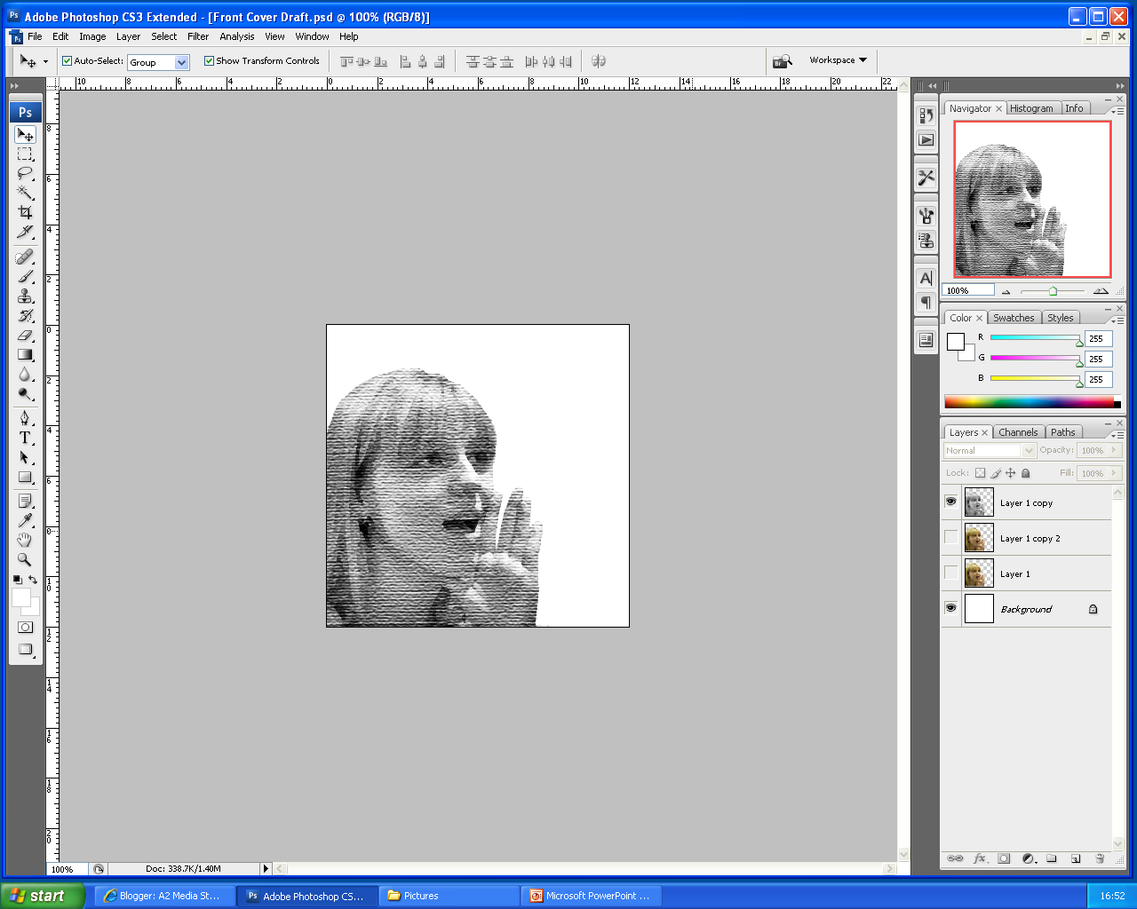 |
| I edited the main image appropriately, using a texturize tool |
 |
| I desaturated the image, and upped the contrast |
 |
| I added a pop art effect |
 |
| I gave the stips a marble effect, adding a russian font - Album title and Artist name |

Friday, 7 January 2011
Russian Constructivism:
I stumbled upon Russian Constructivism when I did some research on Franz Ferdinand's album front cover for 'You Could Have It So Much Better', which I initially liked the style of and decided to take influence from it. It was brought to my attention that the cover was taken from a certain style, the aforementioned style. Constructivism appears to be from 1919 onwards and was associated with designs in industry, and later in revolution. It, as the name suggests, originated in Russia, and features include sharp angles, with a recurring colour scheme of red, cream and black, which mostly are iconic of Russia, due to Soviet rule.
I was previously struggling for a meaning to my music video, especially with the background sequences. It had no link with my ancillary texts, but with the addition of a constructivist influence, I have decided to re-shoot my backgrounds featuring industry and sharp angles, as seen in Russian Constructivist art, finally giving me a theme for my entire production. This, no doubt, will influence my new draft of my second ancillary text, the magazine advert for the album release, in order to keep with the theme.
I was previously struggling for a meaning to my music video, especially with the background sequences. It had no link with my ancillary texts, but with the addition of a constructivist influence, I have decided to re-shoot my backgrounds featuring industry and sharp angles, as seen in Russian Constructivist art, finally giving me a theme for my entire production. This, no doubt, will influence my new draft of my second ancillary text, the magazine advert for the album release, in order to keep with the theme.

This piece of art will strong;ly influence the back cover of my product. Like the Franz Ferdinand front cover which I am taking influence from also, this is an example of Russian Constructivism. Were there is text on the above example, were it says "RUSSIAN ARCHITECTURE..." and "TATUN LADOVSY...", I will be placing the track listing on my back cover.
Thursday, 6 January 2011
Inside Sleeves Work: Inside Panel 1: CD section -
This is the section of my digipak which will hold the CD. I have continued to follow the colour scheme of red black and cream, in this instance replacing the cream with white to create a starker contrast. The CD will be placed over the 'thanks' by the band members.  |
| This is the plastic casing, see-through, that will hold the CD. The background shown will be underneath the plastic casing and CD. |
 |
| This is what the Inside sleeve will look like with the CD atop of the plastic holder. |
Subscribe to:
Comments (Atom)